abs
The abs classes are used for handling absolutely positioned layouts. The class set relies on two class types: 'origin' and 'abs'. The 'origin' must be the immediate parent of an 'abs' class in order to work. This will position all the 'abs' children relative to the boundaries of the parent class.
-
abs--top-left
Positions the element in the top left corner of the 'origin'.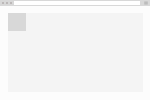
<div class="origin"> <div class="abs--top-left"></div> </div> -
abs--top-center
Positions the element in the top center of the 'origin'.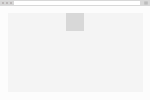
<div class="origin"> <div class="abs--top-center"></div> </div> -
abs--top-right
Positions the element in the top right of the 'origin'.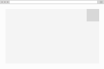
<div class="origin"> <div class="abs--top-right"></div> </div> -
abs--center-left
Positions the element in the center left of the 'origin'.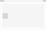
<div class="origin"> <div class="abs--center-left"></div> </div> -
abs--center-center
Positions the element in the center center of the 'origin'.
<div class="origin"> <div class="abs--center-center"></div> </div> -
abs--center-right
Positions the element in the center right of the 'origin'.
<div class="origin"> <div class="abs--center-right"></div> </div> -
abs--bottom-left
Positions the element in the bottom left of the 'origin'.
<div class="origin"> <div class="abs--bottom-left"></div> </div> -
abs--bottom-center
Positions the element in the bottom center of the 'origin'.
<div class="origin"> <div class="abs--bottom-center"></div> </div> -
abs--bottom-right
Positions the element in the bottom right of the 'origin'.
fll
Fill classes provide ways of setting withs and heights based on parent width or view port. This set uses the pattern fll--[viewport/parent]-[(optinal)}w/h].
-
fll--viewport-h
Forces the element to use the current viewport height. (applies height: 100vh)<div class="fll--viewport-h"></div> -
fll--viewport-w
Forces the element to use the current viewport width. (applies width: 100vw)<div class="fll--viewport-h"></div> -
fll--viewport
Forces the element to use the current viewport width and height. (applies width: 100vw; height: 100vh;)<div class="fll--viewport"></div> -
fll--parent-w
Forces the element to use the current parent width. (applies width: 100%)<div class="fll--parent-w"></div> -
fll--parent-h
Forces the element to use the current parent height. (applies height: 100%)<div class="fll--parent-h"></div> -
fll--parent
Forced the element to use the parents width and height. (applies height: 100%; width: 100%)<div class="fll--parent"></div>
flt
The float set is very simple. Apply to elements you would like to flow left or right and you can use the clear to apply a the 'clear fix' to the parent element. Floated elements are taken out of natural document flow and cause text to wrap arround them, allowing to use of images inside of a text block. Uses the pattern flt--[left/right/clear]
-
flt--left
Floats the element to the left.
<p> <img src="url" class="flt--left"> Sed posuere consectetur est at lobortis. </p> -
flt--right
Floats the element to the right.
<p> <img src="url" class="flt--right"> Sed posuere consectetur est at lobortis. </p> -
flt--clear
Clearing of clearfix allows the parents boundaries to wrap around floated elements. If the only elements inside of a element are floated it will collapse because it ignores its floated children's boundaries.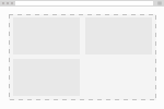
<div class="flt--clear">
    <div class="flt--left"></div>
    <div class="flt--left"></div>
    <div class="flt--left"></div>
</div>
flx
Flex or flexbox is an newer css property that allows two elements to sit next to each other without being float (which was previous to flex the only way to do that). Many frameworks exist that use flexbox to handle grid layouts, but we've opted for a simpler approach. We've separated our widths gutters and flexbox into separate components that can be combined to create grids but are not dependent on each other.
-
flx
Assigns the 'display: flex' property allowing the children to be positioned next to each other.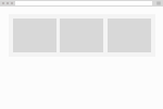
<div class="flx"> <div>First child</div> <div>Second child</div> <div>Third child</div> </div> -
flx--wrap
Allows the flex children to wrap if they reach the limits of the parent's width.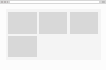
<div class="flx--wrap"> <div>First child</div> <div>Second child</div> <div>Third child</div> <div>Fourth child</div> </div> -
flx--column
Allows the flexed children to orient vertically instead of horizontally.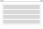
<div class="flx--wrap">
    <div>First child</div>
    <div>Second child</div>
    <div>Third child</div>
</div>
fxd
Position element relative the boundaries of the window. This differs from abs in that it ignores the parent boundaries completely and only looks at the window dimensions.
-
fxd--top-left
Positions the element in the top left of the window.
<div class="fxd--top-left"></div> -
fxd--top-center
Positions the element in the top center of the window.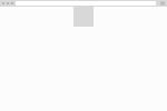
<div class="fxd--top-center"></div> -
fxd--top-right
Position the element in the top right of the window.
<div class="fxd--top-right"></div> -
fxd--center-left
Position the element in the center left of the window.
<div class="fxd--center-left"></div> -
fxd--center-center
Position the element in the exact center of the window.
<div class="fxd--center-center"></div> -
fxd--bottom-left
Position the element in the bottom left of the window.
<div class="fxd--bottom-left"></div> -
fxd--bottom-center
Position the element in the bottom center of the window.
<div class="fxd--bottom-left"></div> -
fxd--bottom-right
Position the element in the bottom right of the window.
<div class="fxd--bottom-right"></div>
grd
Thin grid uses media queries to determine exact positions. Instead of using progressive media quries it uses specific media query ranges to target specific devices. These are approximations of average device dimension. It uses a class pattern of @[device]--[1-6]-[1-6] **Devices** @base @phone @tabletPortrait @tabletLandscape @desktop @desktopWide
gtr
This is the grid class set. It creates uniform spacing between elements that are flex or floated.
-
gtr--xs
Applies a vertical margin of 0.25rem between each element.
<div class="flx grd--xs"> <div>First child</div> <div>Second child</div> <div>Third child</div> </div> -
gtr--sm
Applies a vertical margin of 0.5rem between each element.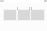
<div class="flx grd--sm"> <div>First child</div> <div>Second child</div> <div>Third child</div> </div> -
gtr--md
Applies a vertical margin of 1rem between each element.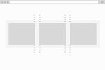
<div class="flx grd--md"> <div>First child</div> <div>Second child</div> <div>Third child</div> </div> -
gtr--lg
Applies a vertical margin of 2rem between each element.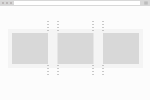
<div class="flx grd--lg"> <div>First child</div> <div>Second child</div> <div>Third child</div> </div> -
gtr--xl
Applies a vertical margin of 4rem between each element.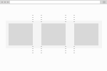
<div class="flx grd--lg">
    <div>First child</div>
    <div>Second child</div>
    <div>Third child</div>
</div>